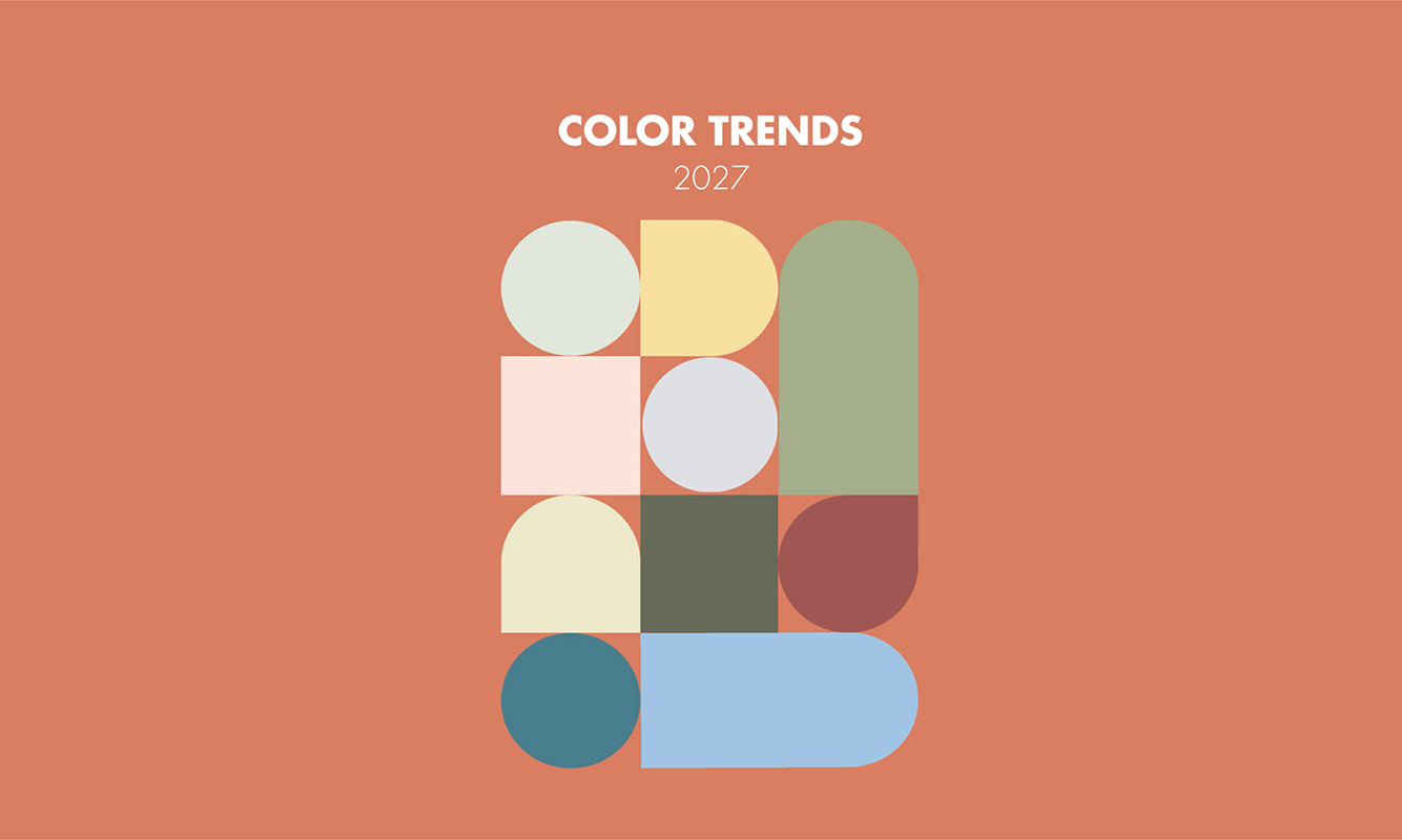
The trending colors of 2027 come together in 3 stories to elevate your projects.
More than just palettes: they are stories of light, emotion and transformation.
Color trends are constantly evolving, influenced by new habits and changes in living spaces. These palettes will inspire you to explore innovative color combinations for your future projects.
The future is already written in color!
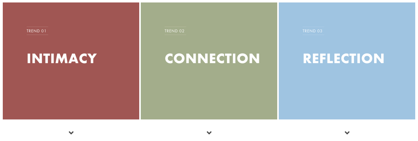
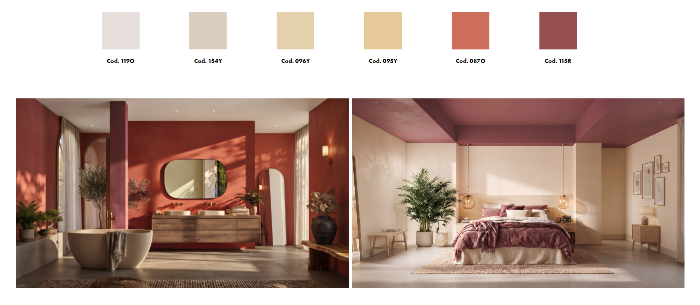
Spaces are increasingly being designed with rest and self-care in mind, leading to the use of subtle, enveloping colors. Color contrasts give way to harmonious transitions that blur boundaries, creating a sense of protection and intimacy.
Light neutrals, warm honey and ochre tones blend with the depth of terracotta and burgundy, creating an enveloping atmosphere that promotes emotional well-being and transforms the space into a calm, restorative retreat.
In versatile spaces designed to accommodate different rhythms and activities, the use of color becomes a way to blur boundaries and encourage conviviality. A neutral base is brought to life by carefully considered color accents, while maintaining an underlying sense of harmony.
Color thus becomes a unifying thread: it defines spaces without isolating them, creating an atmosphere that is both dynamic and balanced.

Natural beige tones, sage green and soft olive blend together to create a serene space, while raspberry and pink add touches of color that bring a dynamic interplay of hues to life. The palette feels sociable, balanced and subtly expressive.
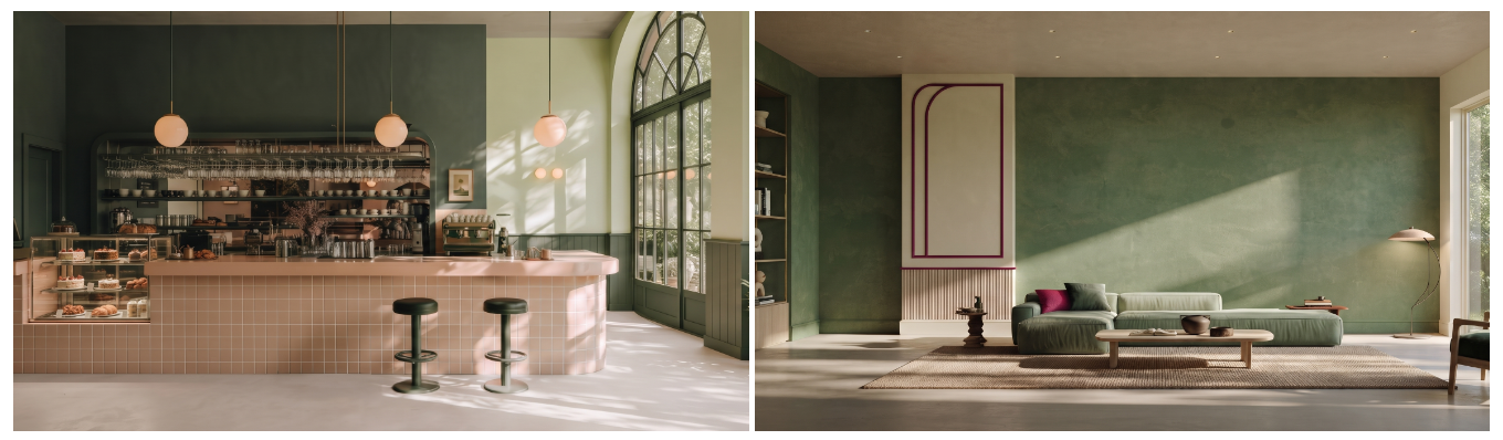
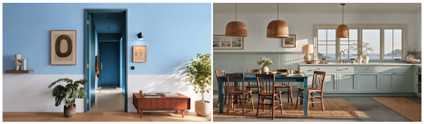
Spatial design is moving towards a dynamic sense of fluidity, where one room flows into the next, creating a visual domino effect. Color creates momentum, generating a subtle wave that carries energy, light and perspective from one room to another.
Rather than static boundaries, spaces acquire a shared rhythm: a single, carefully chosen hue activates an adjacent space, shaping a cohesive narrative in which movement feels fluid, engaging and constantly alive.

In this palette, colors range from misty grays through blue-grays and mineral tones, gradually transitioning to brighter turquoises, revealing a refined color spectrum.
Characterized by subtle nuances that avoid sharp contrasts, the palette allows color to evolve gradually throughout the spaces.